1.HTML Layout Elements
HTML5는 다른 부분을 정의하는데 사용할 수 있도록 새로운 의미 요소를 제공한다.
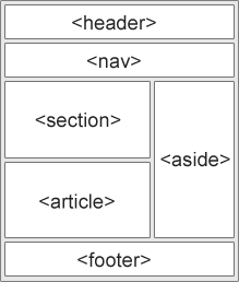
- <header> - 문서 또는 섹션의 머리글을 정의합니다.
- <nav> - 탐색 링크를위한 컨테이너를 정의합니다.
- <section> - 문서의 섹션을 정의합니다.
- <article> - 독립적인 자체 수반된 기사 정의
- <aside> - 사이드 바처럼 콘텐츠를 제외하고 콘텐츠를 정의합니다.
- <footer> - 문서 또는 섹션에 대한 바닥 글을 정의합니다.
- <details> - 추가 세부 정보 정의
- <summary> - <details> 요소의 제목을 정의합니다.
2.HTML Layout 기법
다중 열 레이아웃을 만드는 데는 다섯 가지 방법이 있는데 각 방법마다 장단점이 있다.
HTML 테이블 (권장하지 않음)
CSS float 속성
CSS flexbox
CSS 프레임 워크
CSS 그리드
3. 예제
-----
<!DOCTYPE html>
<html lang="en">
<head>
<title>CSS Template</title>
<meta charset="utf-8">
<meta name="viewport" content="width=device=width, initial-scale="1">
<sty le>
*{box-sizing: border-box;}
body{ font-family: Arial, Helvetica, sans-serif;}
/* Style the header*/
header{
background-color:#666;
padding: 30px;
text-align: center;
font-size: 35px;
color: white;
}
/* Create two cloums/boxes that floats next to each other */
nav {
float: left;
width: 30%;
height: 300px; /* only for demonstrations, should be removed */
background: #ccc;
padding: 20px;
}
article {
float: left;
padding: 20px;
width: 70%;
background-color : #f1f1f1;
height; 300px; /* only for demonstration, should be removed */
}
/* Clear floats after the columns */
section: after{
content: "";
display: table;
clear: both;
}
/* Style the footer */
footer{
background-color: #777;
padding: 10px;
text-align: center;
color: white;
}
/* Responsive layout - makes the two columns/boxes stack on top of each other instead of next to each other, on small screens
반응형 레이아웃 - 두 개의 열 / 상자를 작은 화면에서 서로 옆에 놓는 대신 서로 겹치게 만든다.*/
@media(max-width: 600px;){
nav, article{
width: 100%;
height: auto;
}
}
</style>
</head>
<body>
<h2>CSS Layout Float</h2>
<p>
In this example, we have created aheader, two columns/boxes and a footer. On small screens, the columns will stack on top of each other
</p>
<p>
Resize the browser window to see the responsive effect (you will learn more about this in our next chaper - HTML Responsive.)
</p>
<header>
<h2>Cities</h2>
</header>
<section>
<nav>
<ul>
<li><a href="#">London</a><li>
<li><a href="#">Paris</a></li>
<li><a href="#">Tokyo</a></li>
</ul>
</nav>
<article>
<h1>London</h1>
<p>London is the capital city of England. It is the most populous city in the United Kingdom, with a metropolitan area of over 13 million inhabitants.</p>
<p>Standing on the River Thames, London has been a major settlement for two millennia, its history going back to its founding by the Romans, who named it Londinium.</p>
</article>
</section>
<footer>
<p>Footer</p>
</footer>
</body>
</html>
참조. 
'코딩' 카테고리의 다른 글
| CSS Backgrounds (0) | 2020.03.28 |
|---|---|
| CSS 개요 (0) | 2020.03.28 |
| HTML block and Inline Elements (0) | 2018.11.16 |
| HTML <link> Tag (0) | 2018.11.13 |
| HTML <meta> tag (0) | 2018.11.05 |